The Process
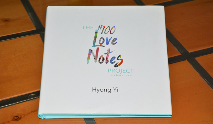
When Hyong Yi set out to honor his wife Catherine Zanga on the first anniversary of her death, Yi and his children handed out 100 love notes on the streets of Charlotte, NC. Their tribute garnered attention around the world, prompting Yi to commission 17 artists to illustrate the notes for two books about the project and about the love that he and his wife had shared.
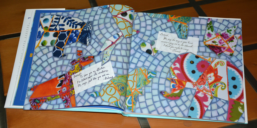
One of the constants throughout their relationship was Yi’s love of origami, from the whimsical creatures he wooed her with in the beginning of their relationship to the 1000 paper cranes he folded as she was dying. In notes #7 and #8, Pamela Goode captured the early origami in a stunning mosaic. With the use of photoshop, we designed the spread so that it appears that the notes are slipped between the glass tiles.
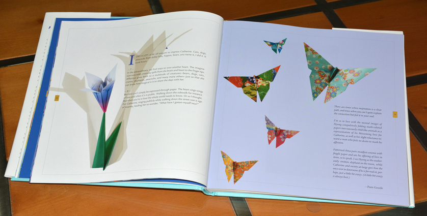
And guess what? We learned from Joseph O’Donnell, another origami artist, that even origami designs are copyrighted. Though this limited the pieces of art we could use in the books, the design sprang to life by using colorful papers and dramatic shadows.
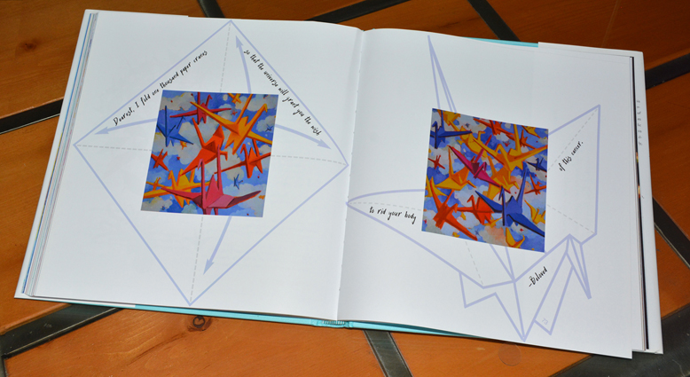
For Note #73, artist Jean Cauthen painted two square canvasses filled with brilliant paper cranes. To offset her art, we positioned the paintings over the diagram that shows how to fold a paper crane, making the story more immediate and compelling.
For my books, 100 Love Notes and The #100 Love Notes Project, I wrote words that served as inspiration for artists. In turn, they took the words and gave them a visual life. And lastly, the designer, Leslie Rindoks, married the two onto the same page, adding her own artistry and giving life to something entriely new. Rindoks produced a book that exceeded what I could ever have imagined.
—Hyong Yi, author
Book Design
What exactly does book design entail? Some would believe that a book is designed by choosing a template and a font. We know that it is so much more. An important first step is to take into consideration how you want readers to feel when they are holding your book. When we know that, we can make informed decisions regarding the size of the book, fonts, images, what type of paper will be best, and more.
Claude Debussy said, “Music is the space between the notes.” In other words, it’s as much about what isn’t there as what is. The same is true when it comes to design. White space—on the page, between lines of text, around images—is an important component of good design and influences a reader’s experience.
If your manuscript is complete and just awaits the ideal layout and cover, we are standing by to help you. With more than two decades of award-winning print design experience, Better Books provides top-quality book design.

Want to Know More?
Email us for more information. Include a brief synopsis of your book, your word count, and target audience.


